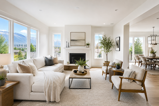

A small home can feel more open when color, contrast, and finish are planned carefully. Paint does not add square footage, but it can change how the eye reads walls, corners, ceilings, and transitions. For homeowners, condominium owners, and apartment residents in Salt Lake City, a thoughtful palette can make compact rooms feel brighter, calmer, and less visually crowded.
Start With Light, Warm Neutrals
Light colors reflect more available light than deep colors, helping walls feel less visually heavy. In Utah homes, warm white, off-white, greige, soft beige, and light gray work well with many common finishes.
Warm white is a strong choice for rooms with limited natural light because it brightens the space without feeling stark. Greige combines the softness of beige with the balance of gray, making it useful in open living areas. Soft beige can create warmth in bedrooms and family rooms, while light gray works best when the room already receives good daylight. Off-white offers a clean backdrop without feeling stark.
Before selecting a color, test large samples on more than one wall. A shade can look different in morning light, afternoon sun, and artificial lighting. Reviewing samples throughout the day helps prevent surprises after painting.

Reduce Sharp Contrast Between Surfaces
Strong contrast can divide a small room into separate visual blocks. Using related colors on walls, trim, doors, and ceilings creates smoother transitions, allowing the eye to move around the room with fewer interruptions.
One practical approach is to use the same wall color on the trim in a different sheen. For example, an eggshell finish on the walls and a satin or semi-gloss finish on the trim creates subtle definition without introducing a competing color. Another option is to paint the ceiling a softened version of the wall color rather than a bright, high-contrast white.
This technique is useful in bedrooms, narrow hallways, and rooms with several doors.
Use Color Placement to Adjust Perception
Paint placement can influence how proportions are perceived. Painting the ceiling a lighter color than the walls can make it feel higher. Extending the wall color onto a low ceiling can soften the boundary and create a more continuous effect. In a long, narrow room, using a slightly deeper shade on the far wall may make that wall appear closer, helping the room feel more balanced.
Accent walls can work in a small space, but they should have a clear purpose. A dark wall behind a focal feature can create depth when surrounding walls remain light. Too many accent colors, however, may make a compact room feel fragmented.
For an easy demonstration, compare two corners of the same room using removable sample boards. Place a warm white or light greige board in one corner and a deeper, cooler color in the other. Observe how the lighter board appears to recede while the darker board feels more prominent. This does not change the room’s dimensions, but it shows how color affects visual weight.
Keep the Palette Consistent From Room to Room
A consistent palette can make a small home feel more connected. When every room uses a dramatically different color, doorways become visual stopping points. Repeating one main neutral through hallways and shared spaces creates continuity, while bedrooms and bathrooms can use related shades for variety.
Choose two or three coordinated colors rather than a separate palette for every room. This works well when living, dining, and kitchen areas are visible together.
Choose High-Quality Interior Paint
High-quality interior paint supports a smoother, more uniform finish and can provide better coverage, washability, and color consistency. These qualities matter in small rooms because uneven roller marks, poor touch-ups, and inconsistent sheen are easier to notice when walls are viewed from close range or under changing light.
Professional surface preparation is equally important. Patching, sanding, caulking, priming, and applying paint evenly can make the final color look cleaner and more intentional.
Get Help Creating the Right Small-Space Palette
The best paint colors for small rooms depend on natural light, existing flooring, furniture, ceiling height, and how rooms connect. The Hive Painting provides professional interior painting in Salt Lake City, including guidance with color selection and careful application for a consistent finish. A professional consultation can help you compare warm white, greige, soft beige, light gray, and off-white options in the actual lighting of your home.
If you are planning to repaint a small Salt Lake City home, condominium, or apartment, start with samples, limit unnecessary contrast, and build a coordinated palette. The right paint plan will not make the home physically larger, but it can help the space feel brighter, more unified, and more comfortable.

Ready to Make Your Home Feel Brighter and More Spacious?
Choosing the right paint colors is one of the easiest ways to improve how a home feels. If you're planning an interior painting project in Salt Lake City, The Hive Painting can help you select colors that complement your space and deliver a smooth, professional finish.
Frequently Asked Questions (FAQ)
How can paint make a room look bigger?
Paint cannot physically increase the size of a room, but lighter colors, consistent color palettes, and strategic finishes can create the visual perception of a larger, brighter space.
What are the best paint colors for small rooms?
Popular choices include:
- Warm White
- Off-White
- Greige
- Soft Beige
- Light Gray
These colors reflect more light and create an open, airy appearance that works well in many Salt Lake City homes.
Should ceilings be painted the same color as the walls?
In many small rooms, using the same color—or a slightly lighter shade—on ceilings can reduce visual breaks and make the room appear taller.
Does the paint finish matter?
Yes. Eggshell and satin finishes provide a subtle light reflection that enhances brightness while remaining practical for everyday living areas.
Should every room have a different color?
Using a cohesive palette throughout connected spaces creates visual continuity, making the home feel larger than using dramatically different colors from room to room.
Is professional color consultation worth it?
Professional painters understand how lighting, room orientation, existing finishes, and architectural details affect color perception, helping homeowners select colors that achieve the desired visual effect.